How Do Illustrators Make Vikings Recognisable When Images Are Tiny?
A Viking can be no bigger than a thumbnail and still be unmistakable. Give the figure a round shield, a hint of a ship and a jagged northern coastline, and most viewers will know the setting before they can make out a face. That instant recognition is no accident: it comes from careful choices about shape, contrast and visual shorthand.
Illustrators working at small scale face a particular challenge. Details that look persuasive in a full-page painting may merge into a grey blur when reduced to a game icon, a phone screen or a printed thumbnail. The solution is not simply to add more Viking things. It is to choose a few strong cues, make them read clearly, and arrange them so the viewer understands the image at a glance.
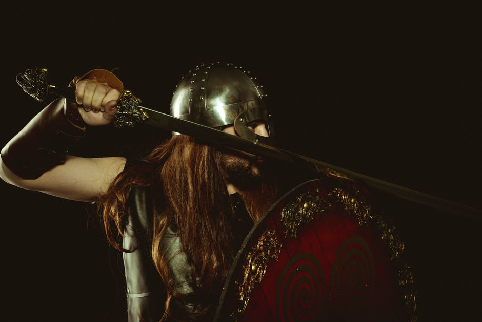
That is where silhouette readability matters. A recognisable pose or prop can do more work than intricate costume detail, while a well-placed ship can establish a whole world. Getting that shorthand right also means knowing which familiar images are historical, which are later inventions, and why some myths remain so useful to artists.
Start with the silhouette, not the stitching
At a small size, the outline of a character is often the first thing the eye catches. A cloak, a shield held at the side, a broad stance or a raised axe can form a distinctive shape even when the face is invisible. By contrast, fine embroidery, belt fittings and carefully drawn hair may disappear as soon as the artwork is scaled down.
Good reduced size character design begins by asking what must survive reduction. The illustrator can sketch the figure as a solid dark shape, without internal detail. If a viewer can still tell what the character is doing—or at least recognise the intended role—the design has a strong foundation. If the axe melts into the arm or the shield becomes part of the torso, the pose may need simplifying.
Make the important parts separate
Silhouette readability is partly about separation. A shield should not sit exactly behind the body if the artist wants it noticed; an axe should not align perfectly with a leg. Small gaps of background around important forms help each object keep its identity. Clear angles matter, too: a straight spear held upright will read differently from a short weapon held close to the body.
Colour and value can help reinforce the outline, but they cannot always rescue a confusing shape. A dark shield against a dark tunic may vanish, even if the colours are historically plausible. The artist might instead use a lighter shield, a bright rim or a contrasting background. The aim is not to make every Viking look like a modern action figure. It is to make the intended information legible.

The compact Viking vocabulary: shield, ship and settlement
Some images carry unusually large amounts of meaning. The iconic props shield ship pairing is a particularly efficient bit of visual storytelling. A shield suggests an armed person and a culture of organised fighting; a ship suggests travel, trade, migration and the sea. Together, they can place a character in a Viking world with very little explanatory text.
The shield is useful because it is a large, simple shape. It can frame a character, create a strong circle in a crowded scene or provide a patch of colour against a muted landscape. Designers may add a painted pattern or a metal boss, but at small scale those marks are secondary. The round outline does most of the identifying work.
The ship offers a different kind of shorthand. A long hull, a line of shields, a mast and a striped sail can suggest a vessel at a glance. It need not be a detailed reconstruction to function as an icon; it does, however, need enough distinctive structure to avoid reading as a generic boat. The low, elongated profile is often more informative than a tiny scattering of oars.
Settlements make the world feel lived in
Ships and weapons can imply movement and conflict, but settlements provide a sense of everyday life. A few steep roofs, timber walls, a storehouse or a shoreline landing place can show that the image is about more than raiding. At a tiny scale, the artist may reduce a settlement to a cluster of roof shapes and smoke trails. Those cues can still suggest homes, work and community.
It helps to think of these elements as a visual vocabulary rather than a checklist. A shield does not need to appear in every Viking image, and a ship is not obligatory. What matters is selecting cues that suit the scene. A trader arriving viking ship rivets and planks at a harbour needs different signals from a farmer standing outside a hall. Combining too many familiar props can make the image noisy, or turn a varied society into a costume parade.
Visual cue What it can communicate Small-scale design tip Round shield Armed character, defence, group identity Keep the outer circle clear; use only a few bold markings Long ship Sea travel, trade, exploration or warfare Emphasise the hull, mast and sail rather than tiny rigging Settlement roofs Home, community and a northern landscape Use a few distinct roof angles instead of many cramped buildings Cloak or tunic Weather, status or character silhouette Separate the outer edge from the body with a clear fold or gap
Games and films establish a setting at different speeds
A film can build context over time. It might begin with a coastline, show a ship approaching, cut to a settlement and then introduce a character. Music, dialogue, camera movement and sound effects all contribute. The audience receives a sequence of clues, so the costume does not have to explain the entire setting in a single frame.
A game often has less time—or less visual space—to make its point. A character may appear as a small portrait, a selectable unit or a figure on a busy battlefield. The player needs to identify it quickly, sometimes while also reading health bars, terrain and other units. A strong silhouette and one or two clear props can therefore be more useful than a richly detailed but indistinct design.
There is a difference between “readable” and “realistic”. Realism can involve subtle materials, layered clothing and varied equipment. Readability asks whether the audience can parse the image under particular conditions: at what size, against which background, for how long, and alongside what other information? A detailed film costume may work beautifully in a close-up but become a muddle when reused as a tiny game marker.
Test the image where it will actually appear
Illustrators can check their work by shrinking it, viewing it in greyscale and placing it against likely backgrounds. They can also ask someone unfamiliar with the brief what they notice first. If the first response is “a person with something round” rather than “a shield-bearing Viking”, it may be time to adjust the pose or contrast.
The process applies across formats. An illustration commissioned for a history article on HistoryMedieval may be seen at different sizes on a screen and in print. A character image for a game, or for a compact promotional tile associated with a name such as Mr Q or MrQ, has its own demands: instant recognition, a strong crop and a design that still holds together when compressed. The medium changes, but the basic question is the same: which few shapes must survive?
The horned helmet: a useful myth, not a Viking fact
The horned helmet is perhaps the most recognisable Viking image—and one of the least reliable historical ones. There is no good evidence that Viking Age warriors generally wore helmets with horns. Practical combat headgear would not benefit from projecting spikes that could catch, pull or complicate close fighting. The familiar horned silhouette belongs much more to later visual culture than to ordinary Viking equipment.
So why does it persist? Because it is exceptionally legible. Two horns instantly create a distinctive outline, even when a figure is tiny or seen from a distance. They also make the character look dramatic, wild and easy to distinguish from other fantasy warriors. Once that shape became familiar in illustrations, stage design, popular entertainment and merchandise, repetition made it feel like an established fact.
This is a useful lesson for artists: a visual convention can be powerful without being historically accurate. A horned helmet may be appropriate in a comic parody, a deliberately fantastical setting or a design that signals “legendary Viking” rather than historical reconstruction. In a historically grounded image, however, it can mislead viewers—especially children or anyone encountering the subject for the first time.
Replace the horns without losing the read
Removing the horns does not mean a character must become visually bland. A strong helmet outline, a hood, a distinctive cloak or a shield held in a clear pose can provide recognition. Artists can also establish the setting through ships, settlement shapes, weather and equipment rather than relying on a single misleading headpiece.
For a tiny image, there may be a temptation to keep the horns because they work so efficiently. But that is a design decision with a cost: the image may become clearer while the history becomes less accurate. A thoughtful brief should decide which goal matters most, and whether both can be served affiliate link disclosure by another bold shape.
The Gjermundbu helmet as a reality check
The Gjermundbu helmet offers an important counterpoint. Found in a richly furnished Viking Age burial in Norway, it is the only near-complete Viking Age helmet known from archaeological evidence. Its iron construction includes a rounded cap and a distinctive spectacle-like face guard. It is not a horned fantasy helmet, and its appearance is a reminder that real protective equipment can be striking without needing theatrical decoration.
It is also a reality check in another sense: one surviving helmet cannot tell us exactly what every Viking wore. Archaeological survival is uneven, and the Gjermundbu example is exceptional precisely because so few comparable helmets have been recovered. Illustrators should avoid treating it as a universal uniform. It is evidence for a real object, not a complete answer to every question about Viking headgear.
At small scale, the helmet’s most useful feature may be its face guard. A simplified version can create a strong, unusual shape around the eyes while staying closer to the evidence than horns. Yet it should be used with care and context. Historical illustration is not improved by replacing one oversimplification with another.
A practical workflow for tiny Viking illustrations
When designing an image that must work at small size, it helps to follow a deliberate sequence rather than adding details until it feels “Viking enough”. A simple workflow keeps the focus on communication and gives historical accuracy room to shape the choices.
- Define the scene. Is this a sailor, a trader, a craftsperson, a warrior or a family at home? The role determines which cues belong.
- Choose two or three signals. A shield and ship may be enough; a settlement and cloak may suit another image better.
- Draw the silhouette. Check whether the pose and major objects remain distinct as flat shapes.
- Reduce the detail. Keep only marks that survive at the intended size, such as a shield rim or a bold sail stripe.
- Check the history. Ask whether a familiar convention, particularly the horned helmet, is being used knowingly or by accident.
- Test in context. View the image at actual size, against the backgrounds and layouts where people will encounter it.
Recognition is a balance, not a costume checklist
The most effective small Viking image is not necessarily the one with the most axes, fur and dramatic weather. It is the one that gives the viewer a clear route into the scene. A readable outline attracts attention; a shield or ship anchors the interpretation; a settlement or shoreline supplies context. Historical care then helps distinguish a convincing shorthand from a tired stereotype.
That balance matters whether the artwork appears in a game, a film companion, a museum display or a blog post. If you are reading this on a screen, the Print Article (PDF/print function) can make it easier to keep the design tips to hand while reviewing an illustration. You can also use the Facebook share option to pass the article to someone who enjoys historical art—or who has just asked whether Vikings really wore horned helmets.
In the end, tiny images reward deliberate simplicity. The best Viking silhouette does not tell the whole story. It gives the audience just enough to recognise the world, then leaves room to discover the people living in it.